It may be a cliché that a picture is worth a thousand words, but a good infographic can really help get an idea across in an accessible way. Because of their advantages you can find them all across the web as well as in print, but here are a few good resources to get you started.
1. Compound Interest
The brainchild of educator Andy Brunning, Compound Interest has a huge collection of infographics about chemistry. They’re often topical, like the chemicals that give Thanksgiving turkey its flavour and aroma, or explaining the work of recent Nobel Prize winners.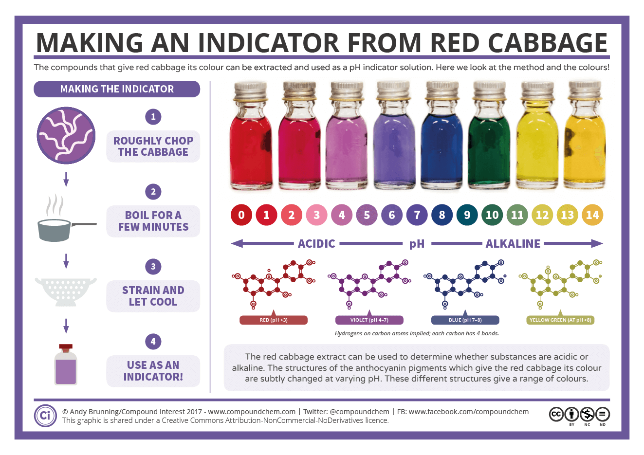
2. NASA JPL
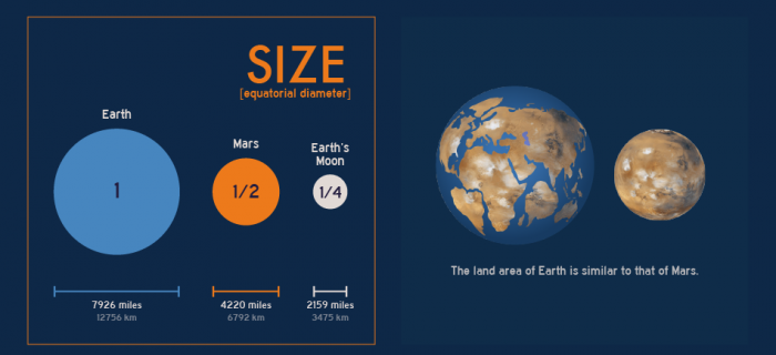
NASA Jet Propulsion Laboratory’s infographic library is of course focused on space and has a huge number to choose from, ranging from general information about the solar system to details of specific missions.
3. World Science Festival
The World Science Festival have a number of specially-commissioned infographics on their site, covering all aspects of STEM.
4. Futurism
Futurism have some fantastic-looking infographics on all sorts of topics across science and technology.
5. Cancer Research UK
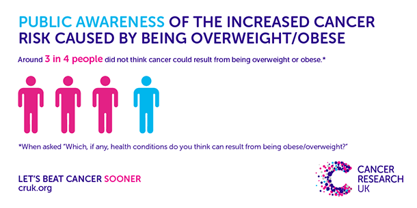
Cancer Research UK’s site is a treasure trove of information about cancer, and they have a great selection of infographics to help make sense of common talking points. The graphics are sprinkled around on their blog, news and information pages but they also have a handy Pinterest page with them all in one place.
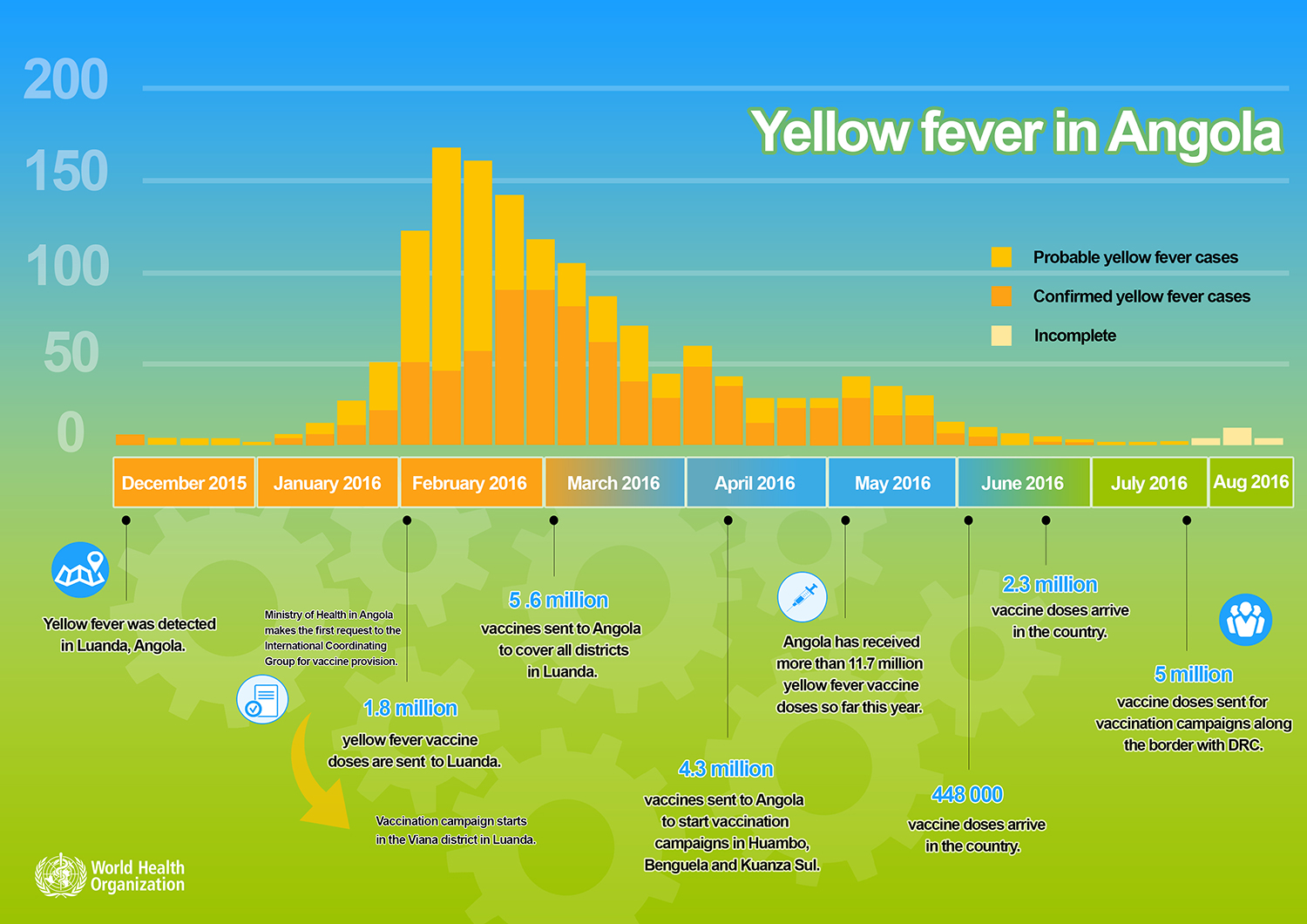
6. WHO
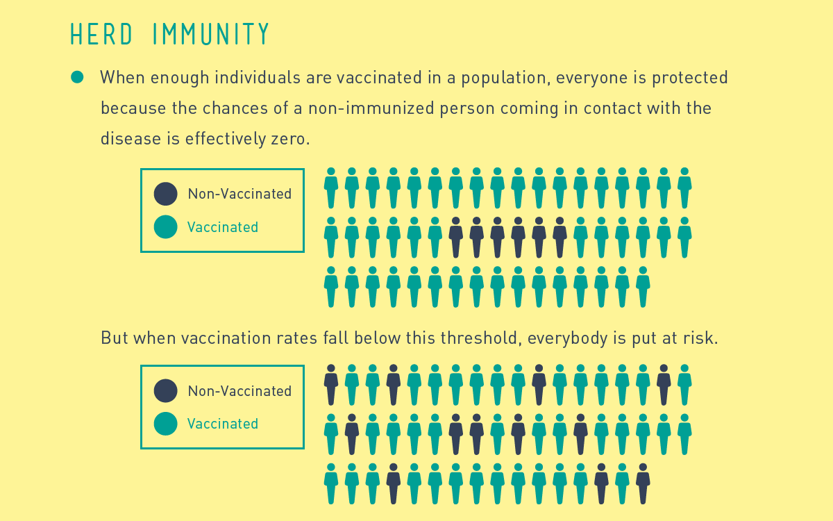
The World Health Organization has a wide range of infographics on offer, covering topics like vaccines, HIV/AIDS and malaria, to name a few.
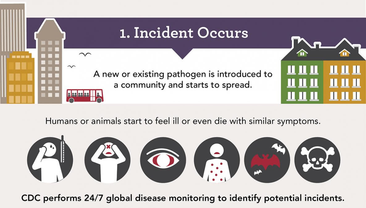
7. CDC
Finally, the CDC have some really handy infographics relating to their work and general information about various issues in health and medicine.
This article was written as part of my November writing challenge, a NaNoWriMo-inspired attempt to write one short, snappy article a day in November. Please excuse brevity, but let me know if I’ve missed anything important!
